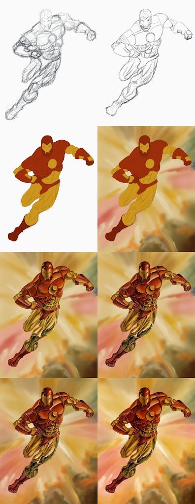
Since my last post has garnered some response, I figured it’d be a good time to show my process for painting for those that may be interested. Here we go! If anyone has any questions, feel free to ask.
Step 1: Start with a rough sketch. And this was really, really rough. It’s just to get to get the major forms into place and to have everything look mostly anatomically correct.
Step 2: Since the design was mostly modular and simple, composed of several cylinder-like shapes, I decided to do a clean sketch over my rough sketch. This would help me further define the forms for the next step.
Step 3: Lay out the flats of the image, further defining the forms and providing separation between the various color forms. This is the first step where the form starts to take a solid shape and the edges are important. Note that I choose to even separate different components by slightly different colors, notably in the helmet and the chest piece as well as the hands and the gauntlets.
Step 4: Start to lay out the background. Really I just want to get something, anything, on the background for the foreground to rest against. So it’s really just roughly working in some of the colors.
Step 5: Here’s where much of the magic starts to happen. With a hard round brush, start to rough in the basic rendering. While the colors are certainly important to start thinking about, I’m mostly concerned with getting the shapes defined as mid-tones, shadows, and highlights to give a basic level of rendering in preparation for the next step.
Step 6: The shapes are further refined and polished to a final level of depth using a soft round brush. Here the image really starts to shine when focusing more on shadow and highlight detail. I continued to work on edge control and more closely looking at the cohesiveness of the image. I really focused on developing the many details and gradients that were in the image.
Step 7: The background is further defined and sharpened with a soft round brush. Some elements, like some of the more cloud-like features, were developed with the smudge tool.
Step 8: Final levels, hue, and saturation development using layer adjustments. The original image was fairly highly saturated with a good level of darkness, so I wanted the foreground and background to really pop.
Thanks for reading!
